Windows 11 available Oct. 5

Those of you looking forward to when you can begin using this new operating system officially now have a date. October 5th – in case you didn’t read the title.

Do I think it’s ready? Not entirely.

Sure overall it runs very smoothly and it really isn’t overall much different from Windows 10. It looks prettier (rounded corners and themes help there) and it has most everything people want. There are a couple of things though that either still need changed/fixed or I question why even do it.

Start Menu

I think the biggest issue will be with the placement of the Start Menu – in the center (more or less). Sure it is far less mouse travel to get to it in its new position, but it will always be moving as well. The more programs you open, the more it moves to the left. Also having it in the left corner has been a stable of Windows since Windows 95. Why change it? To make it more like Apple? It just seems unnecessary – especially if you use shortcuts already pinned to the taskbar anyway. Yes you can move it to the left corner in settings, but most people never touch settings.

There are additional pinned icons in the center (search, widgets, taskview) which move over as well if you change the settings to have them left justified. However all your icons move over, not just the ones I have mentioned. All your pinned apps and all your open programs. I don’t want it like that. I’d like the programs clustered in the middle and the start menu, etc off to the left. No can do.

One other gripe about the Start Menu has is inside it. First, you have a Recommended section below the pinned icons. This is such a stupid name. They aren’t recommended, they are my most recent used documents! Why has this incorrect name persisted? I see nothing wrong with a list of Recently Used items as that could be helpful, but the wrong name, just says “we don’t care about details”. Secondly, you have the All programs list that is horrid looking. I already went over a far better design for it (someone even designed one visually close to my idea). It just sucks!

The very odd waste of space “All Programs”

Widgets

Useless. Need I say more? A better place for this information would be to allow me to create my starting tab in my web browser (or new tab button). It comes from the web and it is mostly web oriented information – why do I need to hit a separate button to get to this? Sure I can pin stuff to my desktop but unless I have more than one screen (which many do not) there is no point.

Search

This didn’t change much – except for the fact that it is no longer called Cortana (which was dropped in Windows 10 as well). Search does a fine job as it is. The main issue with it is when you click the search in the Start Menu, it switches to the Search window with a terrible jolt. They don’t line up! Why is this allowed to stay as is? I should be able to start typing in the Start Menu and have it seamlessly search there OR switch to the Search window but without it startling me. It literally re-loads when you click the Search bar in the Start Menu. Again why is this not being changed?

Store

Yes I know the Store doesn’t yet have Android apps – it’s biggest addition that is missing in this update to Windows 11. That in itself is a bit disappointing but so far the Store has underwhelmed. I like some of the things they have done to change it up, but a couple things still aren’t there. Each big section (apps, games or movies/tv) doesn’t have subcategories. Like apps could have sections for games, social, news, etc but no nothing like that. It makes finding what you might be interested in a slow drudge. The closest you get is the “Collections” at the bottom (so you have to scroll down a lot to get to them).

I want a new apps focus in the store (or whatever is new for each section). Every time I look at the store, it basically looks the same. I’m not drawn into checking anything out. It is boring and static (it does have some “moving” elements, I just mean its looks/feel static). Perhaps it will get better when Android apps get there, but I’m not holding my breath.

I have focused on some of the things I dislike., most of which I won’t use anyway. Overall though Windows 11, despite these gripes, works. The notification center/action center is better and the Taskbar icons identify the status of apps just fine. Is Windows 11 a large jump from Windows 10? Nope. Is it a lipstick on a pig type of an update? Not that either. It just does some things really crappy and some things really nicely. There will be programs coming out to address the more common complaints I’m sure of it by third parties (though you can’t fix the store – only Microsoft can if they choose).

I will continue to use Windows 11 and if anything significant or noteworthy updates (including apps) then I will update here on my blog. Otherwise there may not be much coming in the next few weeks. Thanks to those who have subscribed and read my articles.

Tagged with:
Posted in Windows 11

Windows 11 – Clock Update

Yes not necessarily the biggest news in the world, but the clock app (officially known as Alarms & Clock when searching but only Clock when hovering over it on the taskbar – and in the app itself).

Clock app main page

When you first open this app you’ll have the Focus Sessions page – which is the newest part of the app. This allows you to put essentially a “do not disturb” sign up on your computer. You can then focus on a specific task and even program in breaks so you can “force” yourself to step away.

A built-in task scheduler can add or remove tasks for you to focus on. I admit to being baffled as to what this would constitute since I’ve never worked in a setting with a computer that I’ve felt the need to schedule tasks. I imagine there will be people who like this addition. Additionally you can keep track of your progress – how well you are doing keeping track of your tasks and completing them.

Finally you can link Spotify into the app. It will show you a few of your mixes and specific Focus type playlists. Near as I can tell nothing works unless you have the app actually open. You can launch Spotify from the 3 dot menu in the Spotify section of this app. However, if you wish to play a playlist that is listed, you can’t just click on it, you have to right click and choose “Play” – which seems rather counter-intuitive. The right-click does give you two other options though – Deselect for focus sessions and Reset the Playlist.

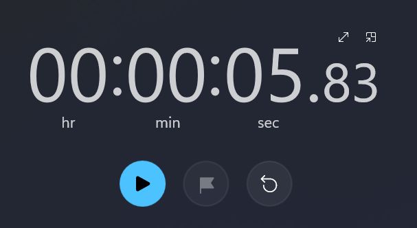
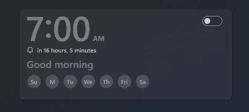
This image has an empty alt attribute; its file name is win11-clockstopwatch.jpgThis image has an empty alt attribute; its file name is win11-clockalarm.jpg

Above you can see the Stopwatch on the left and the Alarm on the right. The Stopwatch can be made full screen. It can also be kept on top like all the sections of the cCock app. The alarm is fairly straightforward and allows you to keep multiple alarms either active or available to choose between.

With the Timer, you can have more than one in use at a time with different names and times. It is quite versatile.

Finally there is the World Clock which only shows your time unless you add other ones. Perfect for those who do business with multiple time zones and have trouble keeping track of the time difference.

With a multiple of options this is a pretty advanced clock in Windows. The Focus Sessions really ups the game, but just depends if people find it useful. Unfortunately I cannot judge that as I have no need for the feature. One little note though in settings there is an option to change the theme (light or dark) of just this app. I suppose that could be useful so that if you choose “keep on top” then it may be more visible.

Tagged with: ,
Posted in Windows 11

New Tab change in Edge

I’m not one who is trying to lead the way on-line with my coverage of Windows 11. However, I have noticed something in Edge (Microsoft’s browser- now default browser in Windows) that I hadn’t seen mentioned.

What the new tab used to look like (it was customizable some)

Usually the “new tab” page in Edge displayed several articles and as you scrolled down, it continued to add more and on and on. Additionally it had a “feature” article section in the upper left that you could scroll through several articles (roughly 20). Generally speaking geared towards your likes, etc if you are signed in to your Microsoft account (which I am).

Updated new tab look

Now, however it has changed. I hate it. I liked it before, but now it is all squished, not mostly taking up my widescreen monitor. So it requires far more scrolling, but strangely the functionality of skimming through about 20 articles is gone. You can still go customize your page, but only in 4 ways :

  • Focused: mainly provides the search bar and quick launch icons and no background (weather also in upper left)
  • Inspirational: gives you a background now and you see the articles a bit more
  • Information: brings the articles up further so no separation from them and the search bar/quick launch
  • Custom: you can add more rows of quick launch buttons, have a greeting on or off, choose types of background image options or choose how much of the content under quick launch is visible

[ Incidentally I didn’t know there was a greeting until I checked out the Custom settings. It shows up in place of the weather, but it goes so quickly I don’t see the point. ]

Also in dark mode I am finding some of the articles images w/text look weird. You can see the one in the lower left in the screenshot above that is washed out on the text. However changing settings in themes isn’t seeming to change anything on this new tab page. Spicy red shown below (with “light” theme supposedly).

Theme options in Edge

So I shutdown the browser and restarted it. Still no change to the new tab. I went to Settings and changed my theme to “light” and still no change in Edge. I guess this is a bug that will be fixed at some point.

It doesn’t change the fact that the new tab page is much worse than before. It not only provides less information, but some of the functionality is gone. Hopefully the theming issue will be worked out in future builds. For the meantime I guess I may be searching for a new “new tab” function – which may become permanent if they don’t fix this new tab page.

FYI: here is my solution.

I went to the “three-dot” menu in the upper right and chose “Extensions”. In there go to the button that says “Get Extensions for Microsoft Edge”. Do a search for “Custom New Tab”. All this extension does is allow you to use a different webpage everytime you open a new tab. I’ve always liked a quick look at news/weather. I don’t use the new tab page as a launch page. So putting “msn.com” as my start page is closer to the former Edge start page that I have found.

It may not work for all but works well enough for me – though I’m still bummed at the other new tab look (the one Edge comes with that recently changed) as I had got very used to using it.

Tagged with: , ,
Posted in Browser, Windows 11

Settings – Fonts

Fonts in settings is more or less the same as in Windows 10. However there is one big improvement that changes everything.

Settings – Fonts

You can drag and drop to install a font. It makes the whole process simpler for adding new fonts. The way it displays each font is not too different from Windows 10, just I can see a lot more and there are more words to choose from.

If you look above you may be able to see a font I added. A Doctor Who type font called Doctor What since I’m a fant of the show. Here is a sample of that font.

Doctor What font in action

Many of the fonts have more options such as bold, italic, etc. You can get to those options just by clicking on the font.

More options for a font

You can use a slider to adjust the size of the font and the dropdown in the Metadata section to choose the type of font you wish to view. Typing in the preview will show you that font in each of the styles shown – very handy. More information including the ability to uninstall it is below.

Anyone who prefers the Windows 10 version is nuts. This is a lot better and really though is only a couple little tweaks from the Windows 10 version.

Posted in Windows 11

Settings – Touch (On Screen) Keyboard

4th in a series on the updated Settings.

New to Windows 11 is the ability to have different looking keyboards when using the touch screen.

16 keyboard layouts

Windows 11 comes with 16 different designs for colors, etc for the on-screen keyboard. If you prefer you can create your own design as well – including the background. A poor looking example below that I made.

Custom Keyboard

There are additional keyboard related options at the bottom of the screen. One leads to things related to Typing. You can have the system automatically correct misspelled words, show text suggestions and even multilingual text suggestions. Finally there is option to change your language, etc.

While an on-screen keyboard has been part of Windows for a while, it is nice that they have added some customizability with it as well.

Tagged with: , ,
Posted in Windows 11

Windows 11 – File Manager

This app has not had much of a change in quite some time. In fact until recently it didn’t even accept theming – it was always the same, consistent. Many people prefer consistency and frankly it makes things easier when you know where things are. However, there are times to update them and so Microsoft has updated some things in File Manager.

File Manager

When you first look at it, it probably appears similar to how it is in Windows 10. The most obvious difference is the top bar of icons. There is no “ribbon” – at least how it has been for a long time. There is a row of icons of various common actions that only are available when that action can be completed.

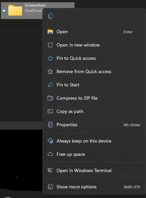
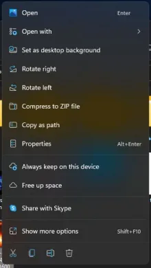
Additionally there is more “space” between them. In an effort to make things easier on touch devices, things are spaced out a bit more. Especially noticeable as shown before in a previous post with the desktop right click menu. The right click menu here has more space with a link for “Show More Options” to use things left off the new right click menu. You can see below a couple of different types that show up based on what you right click on.

This image has an empty alt attribute; its file name is win11fmrightclickonfolder.jpgThis image has an empty alt attribute; its file name is win11fmrightclickonfile.jpg
Right click on Folder (on left) — Right click on image file (on right)

I like the little icons for common tasks with files. The right click on Folder only shows a little icon for copy. However the right click on file shows cut, copy, rename and trash (recycle bin). The reason the icons are on the bottom for the image file is since it opened so close to the top of the screen. Though I’m not sure why that would be the case – it should be consistent.

I do like the bit more space between all the screen elements. I think it makes it easier to see each individual item a bit better. Of course it will be easier to use for those of us with fat fingers for touch. You can really see how crowded things feel when you click the “Show More Options” link. I would really need to use it more to get a feel for how improved it is, but as of right now, it feels much better. As with any change, it takes getting used to.

Posted in Windows 11

Settings – Themes

Third in a series on some of the settings in Windows 11.

Themes have been in Windows for years. In all those years, usually you changed the window decoration (borders) and wallpaper separately. The lockscreen wasn’t even allowed to change until WIndows 10 and continues in Windows 11.

Themes

So as with most portions of settings, the Themes section has been redesigned a bit. I’m not going to cover whether you could do this in Windows 10 or not, but I will cover anything new besides the redesign. The screenshot for the current theme doesn’t show the Start Menu like in Win10, but does represent what you see changed now as you can change the accent color as well.

Out of the box, Win11 comes with 9 themes. You can download more from the Microsoft Store but there are not any new ones yet. These have been there a while.

Missing theming in Themes

The option for “Desktop icon settings” lets you choose which icons like “Recycle Bin” and “Desktop” reside on your desktop. Interestingly this opens with an “unskinned” window. Hopefully something that is fixed in the near future.

Contrast themes

Finally there is a whole section on Contrast themes with 4 to choose from for those who have difficulty with sight or prefer a less colorful view. You have the ability to edit these as well.

Tagged with: , ,
Posted in Windows 11

Settings – Storage

Second in a series going over some of the sections in the Settings app.

As with the HDR section, there is mostly a slight re-vamp as to the presentation of the Storage section of Windows 11.

Storage settings

I like the graphical view of your overall computer and then the apps, folders and temporary files. This is very close to Windows 10. The only thing missing is an “other” section that was for large folders, but has been removed from the initial view in Windows 11. If you wish to see it and other storage categories, there is a link to do just that. I think some settings have been expanded from Windows 10 as well, so a re-design was needed for that purpose.

The link to Storage Sense provides quite a few options if you tend to run short of storage space with your PC.

Advanced Storage

The Advanced storage settings give you even more fine tuned settings for your storage. Not everyone needs to mess around in here but if you do, it’s not far away. Of course again with Settings, a simple search, for example for “Backup options” ,will get you here as well as separately clicking the links along the way.

Tagged with: ,
Posted in Windows 11

Settings – HDR

I’m going to have a small series here covering some of the more interesting sections of Settings. I assume they are changed/updated from Windows 10 but I am not checking exactly.

Settings for HDR

In case you can’t tell by the screenshot, I do not have HDR available for me. (also if you don’t even know what HDR means, click HERE). I’m sure there would be more options here if that were the case. As you make changes, the video would reflect those as well. There is an HDR Calibration section as well to click on if you can do HDR.

It is helpful that there is a link in the settings for “More about HDR” as well as a link to the Video Playback section of settings at the bottom. Video Playback existed in Windows 10 but this just adjusts some of the visual elements.

Tagged with:
Posted in Settings, Windows 11

Windows 11 – Misc changes

There are several changes in Windows 11 that don’t warrant their own article.

For instance when you right click on the desktop, that menu has been revised to fit the UI design of Windows 11. If you click “Show More” you actually get the full right click menu from Windows 10. You can see both below.

Windows 11 Right Click

Windows 11 Show more options right click

The one on the left also has theming as part of it and everything is more touch friendly on the “old version”. So if you don’t like that options like Share aren’t right there, they aren’t too far away.

Another small addition- though it may be bigger for people who like to multi-task. The addition of being able to have multiple windows of different programs (or possibly the same) on screen, in view, at once. This is something never before built into Windows. All you have to do is hover over the maximize button and you are presented with several options. Moving the mouse down will highlight the section of the screen your current app will move to. In one of the remaining sections, you’ll get a choice of currently open apps to place there.

If you decide not to open another app there, this can easily be cancelled out of by either minimizing, maximizing or closing the other app (s). I am unable to test this across multiple monitors, but I would imagine this will help tremendously with those setups. I could see no way to make the apps always open in this view though.

One change that is more subtle is the login screen. When your computer starts there is a large clock front and center with day and date below it. Depending on other login choices there will be other things visible, but the main change is the large clock.

Two last small things. One is that the Search on the taskbar will show your last 3 program searches on hover as seen below.

Shows when hovering over search

The other things is a carryover from Windows 10. If you right click on the Start Menu, you will still get a nice little shortcut menu for things like many Control Panel settings – yes they do not open in the Settings app. Though you can launch the Settings app as well as File Explorer, Task Manager, Search and Run.

I may have missed some other small changes but this is it as I can see for now. I plan to get into some of the settings views next.

Tagged with:
Posted in Windows 11

Enter your email address to follow Through The Panes and receive notifications of new posts by email.

Join 120 other subscribers

Have an app you'd like to see reviewed. Send me an e-mail.

Through The Panes

Categories